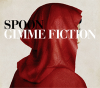
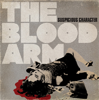
 In an age of iTunes, Sean McCabe considers album art a lost artistic medium.
“It’s a craft that’s dying and not celebrated anymore,” he explains. “It’s assumed that everyone with a computer can be a designer.”
The Brooklyn-based illustrator, however, didn’t have computers while studying graphic design in college, and he rarely uses them in his work now. Yet his handmade album art has defined bands such as Interpol, Spoon, Asobi Seksu, and Mates of State.
McCabe, 35, grew up on two things: collecting records and drawing. The record sleeves that he owned growing up heavily influence his work today.
“I’m a very nostalgic person,” he says. “I grew up with old covers and I think I’ll intentionally age something as a result of tapping into my memory.”
Asobi Seksu’s first album is possibly the best example of his artistic techniques. While thinking of ideas for the cover, he asked singer/keyboardist Yuki Chikudate to translate the lyrics, which were mostly in Japanese. McCabe found them heartbreaking.
“They were no different than the songs on Ronettes records,” the girl-group enthusiast says.
The result is a worn-looking CD package that looks like it could’ve existed in the sixties with a mini-biography and review on the back. The cover features Chikudate resembling a “teenager in love,” crying in bed and surrounded by Polaroids.
“Usually the most simple and direct approach is the most elegant.” – Sean McCabe
“Usually the most simple and direct approach is the most elegant and beautiful,” he says.
But McCabe is arguably most known for creating the covers to Interpol’s Turn On the Bright Lights and Antics. As luck would have it, Interpol’s debut was the first record cover he ever designed. While working at MTV.com, a colleague who was managing bands asked him to do it.
“I had no idea that this band was going to be huge,” he says.
The cover is a photograph of a theater in London from his personal collection and uses a minimalist color palette of black, white, and red.
“With Interpol, it’s more what you see is what you get,” he says. “(Turn On the Bright Lights) is cold, ominous, mysterious, and abstract enough to be interpreted many different ways.”
The color palette he used has since been synonymous with the band.
 Every band McCabe has worked with has been directed to him through word of mouth. For him, there is no PR agency or studio. He works out of his apartment, moving furniture so he can have photo shoots with bands and their instruments or creating contraptions that allow him to catch natural light at various angles.
“There’s no budget,” he says. “You make do with what you have.”
While he may spend hundreds of hours working to create the perfect album cover, he considers it worthwhile when he sees the finished product in stores.
“It’s the most thrilling experience,” he says. “You feel proud. It’s almost surreal.”
McCabe is currently teamed with Warner Bros. Records, designing artwork for some of their up-and-coming bands such as Head Automatica, Men, Women, and Children, and The Films. Aside from creating album art, he does freelance illustrations for major magazines such as Wired, GQ, Spin, Newsweek, and Jane. But he considers album art a personal medium that will always hold a place in his heart.
“I attempt to create some kind of magic, and I do this because I love it.”
– Kristine Capua
