Aaron Turner, founder of Hydra Head Records and frontman for pioneering metal band Isis, is no stranger to the art of making an album, from the studio to the shelves.
In addition to laying down guitar riffs and vocals, Turner is an accomplished visual artist, responsible for cover art, layout, and package design for numerous bands. This unique knack for the aural and visual aspects of music inspired us to ask Turner about his favorite fellow double threats.
My Favorite Musicians/Artists/Designers
by Aaron Turner
Album art is and always has been an extremely crucial component of the experience of an album for me. Though there certainly have been records I’ve loved that have had terrible cover art, most of those that have left an indelible footprint in my mind have been those with a visual presentation of power equal to that of the music.
When I think back on the records that have shaped my ideas about what it means to make music, I usually have a tangible feeling that comes with that recollection, a sense of the atmosphere that the record created for me and how that atmosphere was accentuated or more clearly defined by the accompanying sleeve art. As that has been true in the past for me, so it is now; when checking out new records, I’m consistently drawn to those with compelling covers that draw me in and make me what to know what’s going on inside.
In the last 10 years or so, I’ve become particularly interested in musicians who are also active participants in designing or creating artwork for the albums that they make. It seems logical to me that those people would have the best understanding of what the music is about and the clearest idea of how to communicate that visually. Some of my favorite album covers now are those that have been made wholly or in part by the musicians who also have created the music itself.
Below is a list of people who reside in that category of musician/designer/artist and who have excelled at both aspects of making memorable albums.

1. Fangs Anal Satan (Boris)
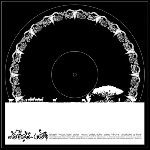
Boris has made some tremendous albums over the years, and the music has always been matched by the equally excellent illustration and design. Like the band, which has mutated through a series of different incarnations (in sound rather than personnel), so too have the visuals, without ever dropping in consistency of quality.
From album to album, numerous tactics have been employed: rigid restraint bordering on minimalism, unorthodox packaging materials (colored foam, die-cut cardboard, hand-painted boxes containing dried flowers, etc.), psychedelic fantasy scenes paying homage to ’70s album artist Roger Dean, parodies of classic metal logos (Venom), extensive and beautifully arranged LP-sized photo books. Each release is a special artifact in its own right and as such warrants even further focus towards the music and the packaging from the listener/viewer.

2. Faith Coloccia
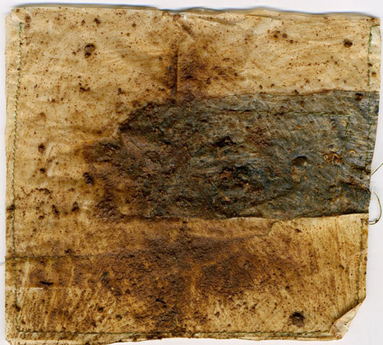
Though many attempt to create interesting record sleeves by making handmade packaging, most simply content themselves with the fact that the packaging is handmade rather than actually thinking about the meaning of the materials being used, their relation to the music, or the end result of how the release will actually look.
Coloccia’s work is quite the opposite: each element used is carefully selected specifically because of its direct connection to the music as well as how it looks visually — black ashes retrieved from a fire made on tour, fragments of materials used in live performances, yellowed paper inherited from dead relatives or discovered at sites used by the band members for varying purposes.
The emotionally driven and deeply personal sounds are reflected in the packaging, which clearly has been crafted by the same hands that made the music. Even in the instances where a more mass-produced printing method has been employed, the humanity of the creators still is clearly evident in the form of the expressive brush stroke, the age of the paper upon which it was laid, or the intimacy of handwriting used to draw out the text. In an age where computers have corroded the spirit of both album sleeves and the music that they encompass, this is a truly vital approach that is clearly more about artistry than marketing.

3. Stephen O’Malley
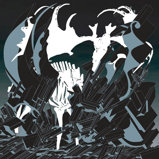
As a founding member of Sunn O))), Khanate, Burning Witch, and KTL, as well as the defining visual voice of Southern Lord Recordings, O’Malley has been a major driving force in forward-thinking metal-oriented music and visuals. One of the few operatives comfortable straddling the lines of fine art, doom metal, and experimental music of various forms, Stephen uses type as an image to largely define the sleeves for his own bands as well as those for others.
From the caustic appropriation of heavy metal’s favored blackletter fonts to the vector-based sculptural abstractions of classic Helvetica, he creates visual worlds in which letters and images are mangled and twisted beyond recognition as are the musical formations they are intended to represent. Not content to make music that is quickly absorbed and quickly forgotten, O’Malley also favors packaging of a complex and elaborate nature, which, like the above-mentioned people, requires more effort to decipher and digest than most of the albums passed off as “heavy” and/or “experimental.”
 4. Andrew Chalk
One of the more elusive characters in this group, Chalk has made his mark as a solo artist as well as a member of drone-oriented projects such as Mirror, Ora, and as a contributor to David Jackman‘s Organum. Aside from having made sleeve art for the majority of his albums on other labels, he now has his own Faraway Press imprint for which he also does the most of the visual work.
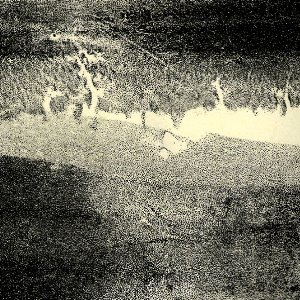
Like the music he makes, his imagery is often abstract in nature, though not in an evasively vague way but in a clearly focused and deliberate manner. His art and his music seem to be based on the intersection of improvisation/chance and controlled manipulation, though I can only assume that this is the case due to the lack of information available on him. The results of his efforts are something that allows for multiple interpretations by the viewer/listener and provide for an ever-changing interaction with the works over time and subsequent inspection.
By favoring small editions of his releases, Chalk is able to expend extra and individual attention on his album covers, utilizing various processes of printmaking, drawing, and painting, thereby creating editions wherein no two copies of a given release are alike, allowing for an even more intimate connection between artist and audience.


Nice selections. I like the use of texture and tone to create that sense of emotion that comes through in the music. If you haven’t heard of Nova Scotian Arms they create some really nice stuff, both on cassette, vinyl, cd and it’s all limited editions and hard to come across. I think you’d dig them. check them here.
http://novascotianarms.blogspot.com/