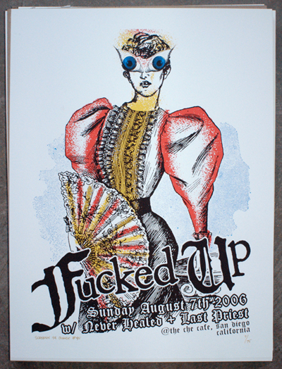
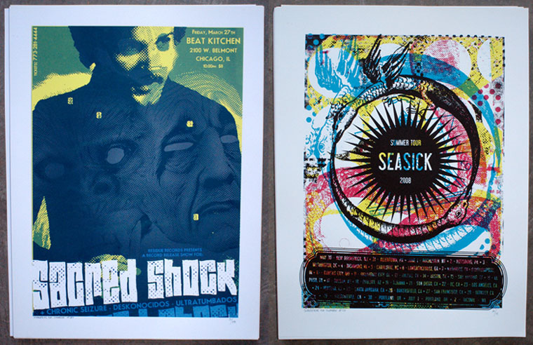
Paul D’Elia, a Los Angeles-based screen-print poster artist, reviews work on Art4Punks.blogspot.com. “There is so much amazing visual eye candy out there in today’s fast-moving world,” he says. “My blog just seemed like a good way for me to pin down and focus in on what most impresses me.”
Keeping himself busy with a full-time gig at surf company Quicksilver, the East Coast native has spent the past six years building and establishing his lovechild, Screenin 4 A Change, which opened its first solo show on August 14, 2010 in North Hollywood. Screenin 4 A Change caters to the DIY punk and hardcore communities with designs featuring Modern Life is War, Fucked Up, and Paint it Black.

“All the bands I work with are really down to earth and awesome,” D’Elia says. “Even better, they are creating music that speaks to me and inspires me, so for the most part, my job is easy if I can connect with the music.”
Uncomfortable with the “graphic designer” label, D’Elia uses a hands-on, organic process with his prints before digitizing them for screen-print separation. “I really love collage work and hand-done typography, so I try to incorporate those elements wherever I can,” he says. Meshing together torsos, televisions, and anacondas to create cohesive — and somewhat disturbing — images is D’Elia’s trademark.
As a musician who has been in a string of bands, D’Elia knows the familiar feeling of flattery, and that’s exactly what he’d like to accomplish with his work. “I can remember being on tour in one of my old bands and rolling into some town I had never heard of to find that some kid made us posters ’cause he was pumped that we were playing,” he says. “I want to give that feeling back to the next generation of kids going to shows and playing in bands.”
More of D’Elia’s work can be found on FocusOnTheNegative.Tumblr.com.
Poster Art is a biweekly column about today’s independent poster art and the artists who create it.

