Posters & Packaging: Died Young, Stayed Pretty

An insightful look at America’s underground poster community, Eileen Yaghoobian’s Died Young, Stayed Pretty chronicles the filmmaker’s multi-year trek across the US and her fastidious quest to capture poster art’s cultural presence.

The film — which is Yaghoobian’s first feature-length project — focuses primarily on poster-art giants who are generally unknown outside of their field of work. Additionally, Died Young, Stayed Pretty addresses the prospect of posters functioning equally as advertisements, artifacts, and pieces of fine art.

In 2004, Yaghoobian set out to create a film both “transparent and true” to its subject matter. Initially fascinated by the artwork she saw on GigPosters.com, Yaghoobian felt an immediate connection with the imagery, and thereafter set out on a three-year road trip across the US in order to discover the “language of posters, and their cultural dialogue” within the landscape of America.
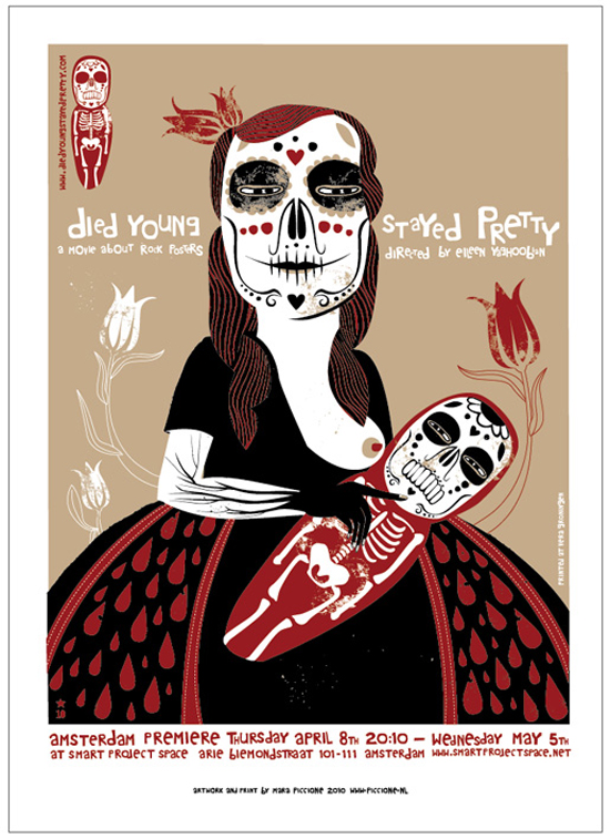
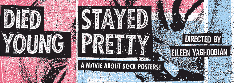
Mara Piccione: "Died Young, Stayed Pretty" poster
Mara Piccione: Died Young, Stayed Pretty poster
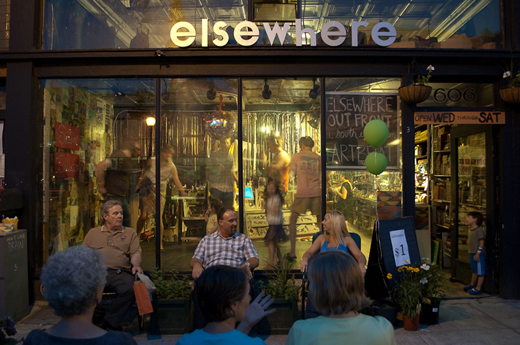
Elsewhere Collaborative

Gallery Spotlight: Elsewhere Collaborative

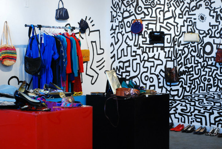
From 1939 to 1997, Sylvia Gray operated a multi-level thrift store in downtown Greensboro, North Carolina. Throughout her life, the building housed eccentric collections of fabric, household goods, toys, and other bric-a-brac; eventually, the inventory came to resemble a hoard of tastes and memories, amassed into a fractured narrative.

The building came into the hands of Ms. Gray’s grandson, George Sheer, in 2003. Along with the help of collaborator Stephanie Sherman, the former thrift store emerged as Elsewhere Collaborative — a living museum and experimental arts platform.
 

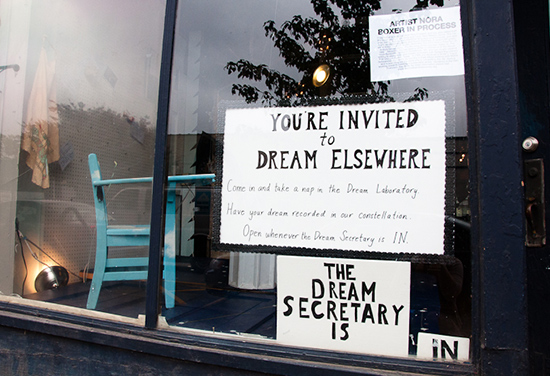
Elsewhere Collaborative: Dreams exhibit

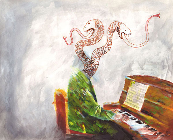
Donovan Foote: Piano Man

Posters & Packaging: Donovan Foote

Designer and illustrator Donovan Foote was entranced by the practice of drawing as a little kid. This preliminary interest led to his discovery and appreciation for comics and cartoons — an influence that’s readily apparent within his work.

Around the age of 11, Foote took up trumpet. “My dad is a big jazz guy, so I grew up listening to a lot of jazz music,” he says. “Most of my friends were only listening to rock, so I think the exposure to something other than rock ‘n’ roll had a big impact on me.”

Foote went on to play in a seven-piece ska band during high school and college, which revealed a whole realm of underground music. “I really loved all the new and odd music I heard while playing little shows,” Foote says. He eventually went on to pick up bass and currently plays in the Chicago-based band Torch Singer. The band will soon release its debut EP, Living Room, but Foote’s musical endeavors are more or less a side project to his visual work.

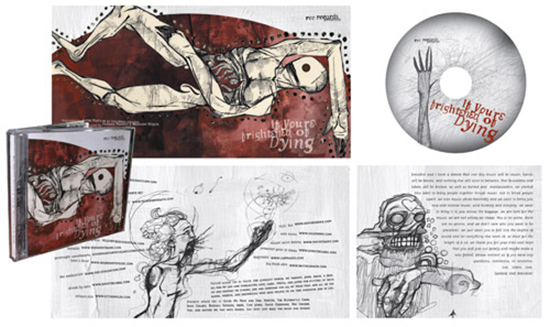
Donovan Foote: If You're Frightened of Dying album art
Lloyd Eugene Winter: Finn Riggins vs. Wilderness

Posters & Packaging: Lloyd Eugene Winter IV

“Getting a Walkman changed my life,” begins poster artist Lloyd Eugene Winter IV. “I had to have music with me everywhere I went.” Winter’s affair with music only heightened as the years went on. After entering college to study fine arts, Winter performed in approximately three music collaborations or bands per semester. It was during this time period, surrounded by a constant array of sound, that Winter discovered his love for screen printing and began to develop his personal aesthetic.

Currently residing in Portland, Oregon, Winter works as a graphic designer — a medium in which he is primarily self-taught — creating product packaging, logos, and various designs for Internet and print publications. His eccentric visual taste and musical passion are visible through his highly detailed band posters, albums, and T-shirt designs.
 

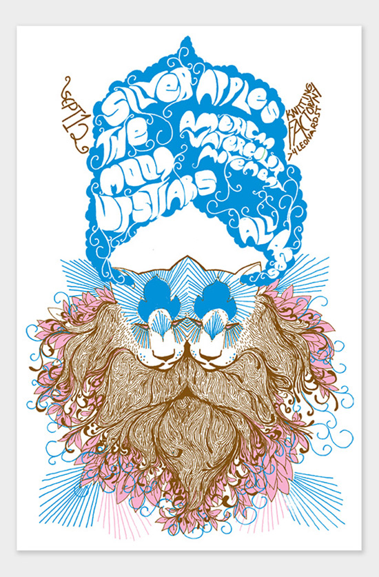
Lloyd Eugene Winter: Silver Apples poster

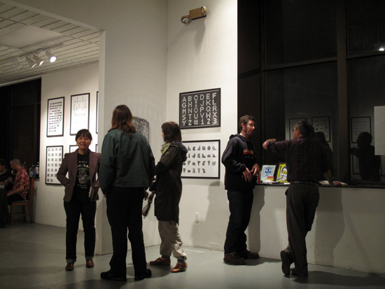
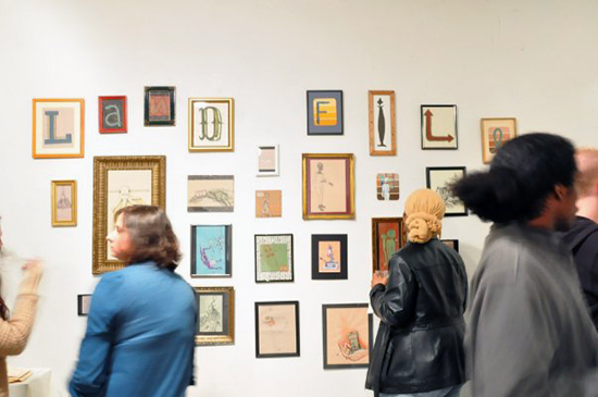
Current Gallery: Alphabet exhibit (photo by Eileen Wold)

Gallery Spotlight: Current Gallery

Originally formed by 14 Baltimore artists as a short-term artist cooperative, Current Gallery is now in its second home and is currently functioning as a non-profit gallery and artist studio. The space came to life in 2004, after the initial group of young artists received a grant from the city of Baltimore for a proposal to productively utilize an unoccupied downtown building.
 
 Jordan Bernier: "Flatlands" poster

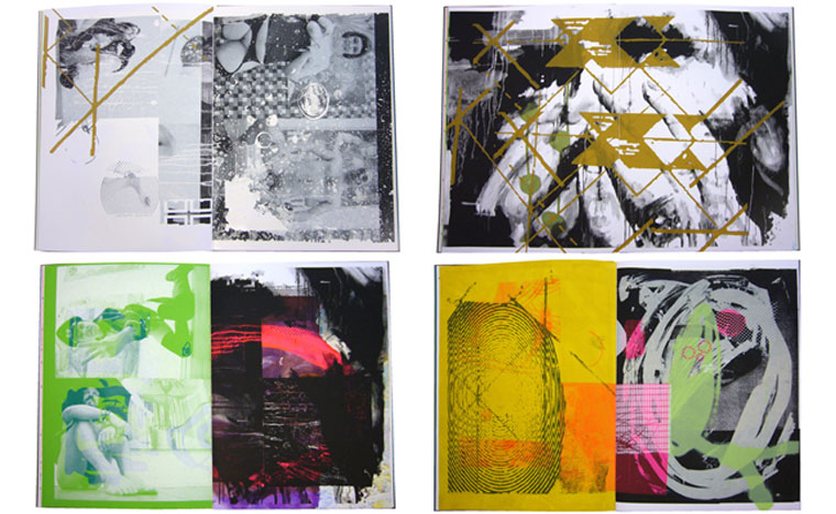
Bongoût: spreads from Down the Rabbit Hole

Posters & Packaging: Bongoût

Located in the central borough of Berlin is the unsuspecting, quirky graphic-design studio and gallery Bongoût. The owners, Christian Gfeller and Anna Hellsgård, have long been infatuated with music, so the prospect of producing music-inspired visual art came naturally to them when they began collaborating on graphic-design projects in 1995.

“When Anna and I first met,” Gfeller reminisces, “we both owned massive vinyl collections. Over time, and due to several house moves, the non-vital part of the collection was cleaned – but we still own a few thousand records. Music plays a very important part in our lives – not just the music itself, but the whole cultural surrounding.”

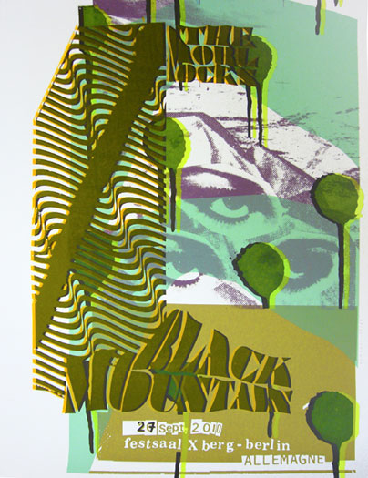
The two designers are particularly fond of obscure punk, noise, lo-fi recordings, black metal, world music, and electronica. These eclectic influences are clearly discernible within Bongoût’s artwork. The duo has created posters and album covers for a diverse set of genre-defying clients like Black Mountain, Ariel Pink’s Haunted Graffiti, and PJ Harvey.
 

Bongoût: Black Mountain concert poster

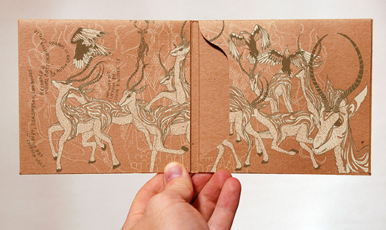
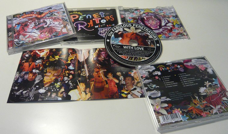
Adam Pobiak: The Fabulous Penetrators' With Love packaging

Posters & Packaging: Adam Pobiak and the UK silk-screen scene

Although the art scene in London is constantly bustling with emerging bands and imminent visual artists, its poster-arts community is barely on the radar. “Silk-screened posters in the UK are nowhere near as popular as they are in the States,” says British designer Adam Pobiak. “Let’s put it this way: I’ve never seen a silk-screened poster at a show that I didn’t do myself.” However, the scene is growing, and people are slowly starting to catch on to the art of poster production.

The imagery within Pobiak’s work comes from a hodgepodge of sources. He takes many of his own photos and works with a variety of found imagery that originates from the likes of stock-photo catalogs and pornography sites. “I feel that if you can recognize the original photo I’ve used,” Pobiak says, “I haven’t done my job.”

Yellena James & Pete Belkin: "Strike"

Gallery Spotlight: Gallery Hijinks

The Mission District in San Francisco has been a relentless spotlight for arts and culture since the 1970s. Initially home to various Latino populations, the neighborhood has featured vibrant murals to express its residents’ social, political, and community concerns.

During the past 20 years, the area has attracted aspiring young people of various ethnicities due to its relatively low cost of living. More recently, the Mission District has grown into a progressive independent arts district. Although the area continues to boast its unyielding street art, it also has become home to an array of creative businesses and alternative art spaces. One of these businesses is Gallery Hijinks.
 

Ryan Riss: "Permenant Vacation"

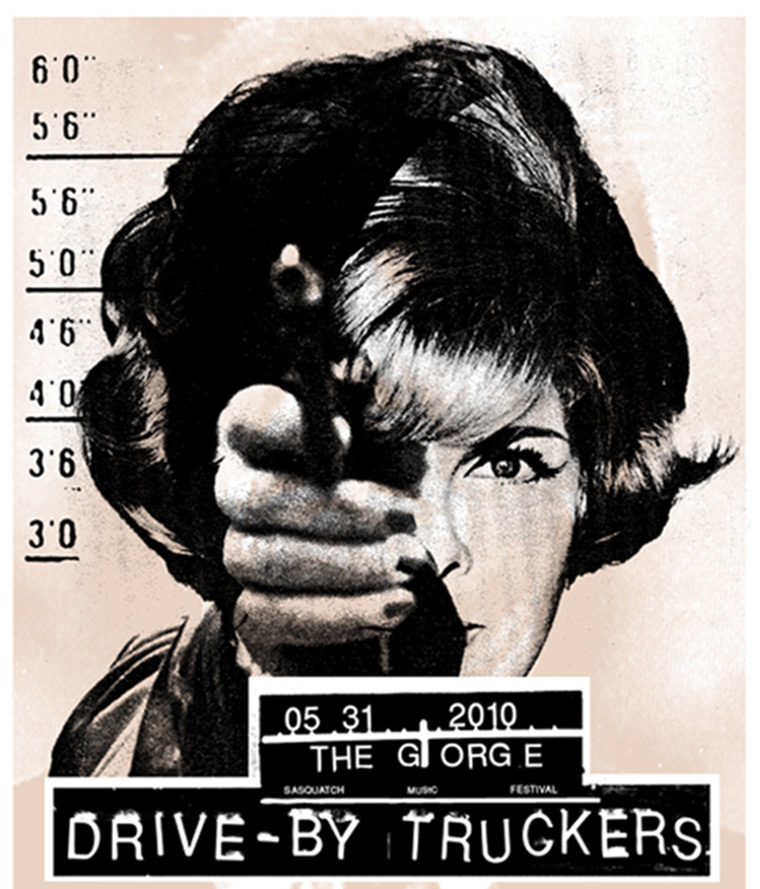
Joanna Wecht: The Drive-by Truckers concert poster

Posters & Packaging: Joanna Wecht’s New Feminism

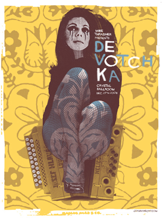
In an art field dominated primarily by men, Joanna Wecht’s work stands out not just because it is eye-catching and full of wit, but also because it has a gender. Wecht exclusively integrates both women and the concept of femininity into her alluring designs.
 

Joanna Wecht: DeVotchKa concert poster

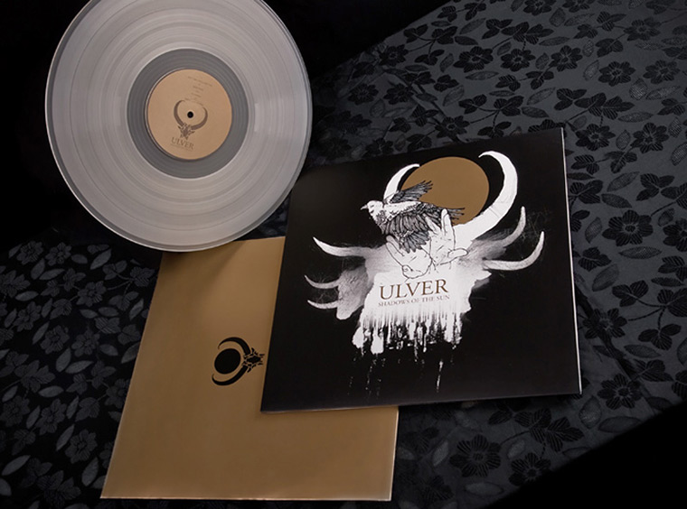
David V. D'Andrea: Ulver album art (photo by Roger Johnsen)

Posters & Packaging: David V. D’Andrea’s Psychedelic Haunts

The connection between visual and auditory art seems natural to graphic artist David V. D’Andrea, who notes KISS album artist Ken Kelley, Metallica’s merchandise designer Pushead, and Dischord Records founder and designer Jeff Nelson as fundamental influences. “The artists I looked up to when I was young were all music based,” he says. “Early on I saw the music and visuals as one in the same.”

Since the early 1990s,  D’Andrea has gradually become a staple in the West Coast music scene. Growing up, D’Andrea produced zines and fliers – generally in the DIY fashion of Xeroxing – for a variety of underground bands in the Oakland, California area. By the mid-’90s, the artist’s work began to receive well-deserved attention: D’Andrea soon had a commission for an album cover.

David V. D'Andrea: Swans poster
Odessa

Gallery Spotlight: Odessa

An interactive and progressive gallery space in Memphis, Tennessee, Odessa is slowly gaining attention as a unique underground arts and music space in the South. It’s situated in the Broad Avenue Arts District of the Binghamton community in Memphis, a neighborhood that originally was on the railway line between Tennessee and North Carolina. Eventually, the suburban area was annexed by the city of Memphis. Although the neighborhood remains underdeveloped, it boasts a strong sense of community and is gradually emerging as an important addition to the city’s aspiring arts scene.

Odessa

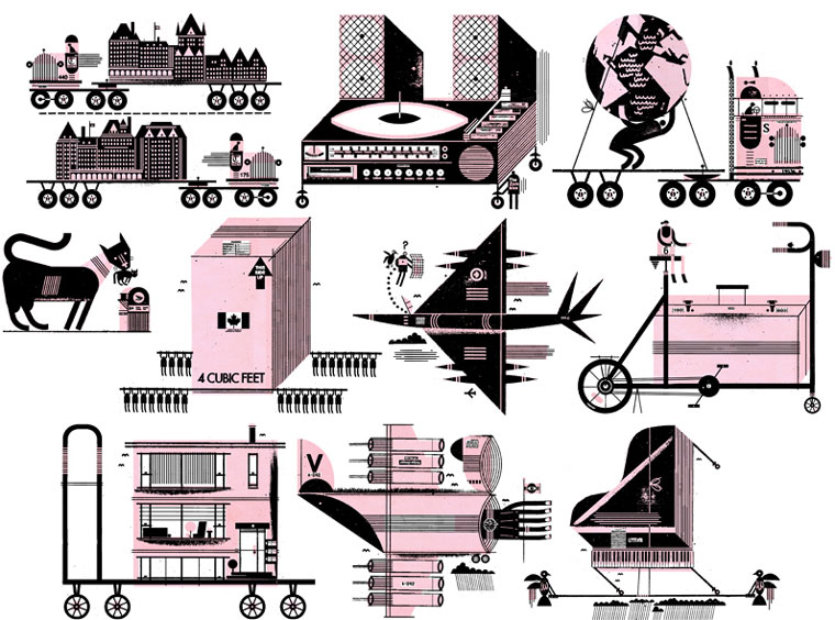
Raymond Biesinger: "Miscellaneous Spots on Moving House, Studio, and Head"

Posters & Packaging: Raymond Biesinger’s content-driven contrasts

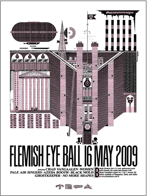
Formally educated in American and European history, poster artist Raymond Biesinger uses historical remnants, politics, and statistics to drive his work.  He values content and intelligence in design — not just illustrative work that “looks nice” — and his work is increasingly conceptual, rather than empty or impersonal.

A self-taught illustrator and designer, Biesinger is foremost a graphic designer for periodical publications and advertisers, but his eccentric drawings also are visible on band posters – especially for his own band, The Famines. Though he doesn’t pay much attention to contemporary artists, Biesinger is instead influenced by minimalism, structure, rationality, and wit – aspects that are all apparent within his work.

Raymond Biesinger: Flemish Eye Ball