Operating his printing and design practice under the name Crosshair, Dan MacAdam has taken a unique approach to poster art while working with the screen-printing medium for more than 15 years.
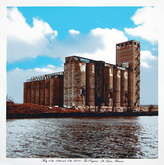
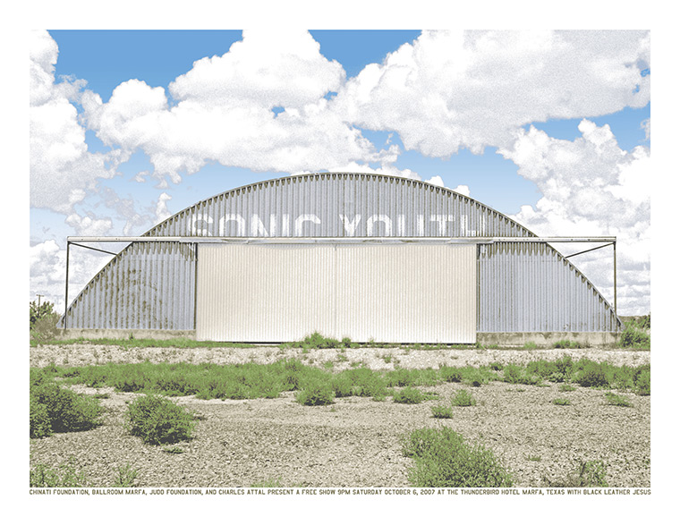
His recent work fully integrates the text — which is generally minimal — into the visual context of the image instead of displaying the text and image as two separate entities. Thus the image as a whole appears natural and undisturbed as it provides information to the viewer. In essence, instead of reading, the audience is viewing and absorbing the design.

Based out of Chicago, MacAdam places a strong emphasis on photography in his work, and generally, the screens for his prints are generated directly from an original photograph.
“My process is always focused on the print,” MacAdam stresses. “Even when I’m taking the photograph, I’m thinking about how the print is going to work, what inks I’m going to use, how I’ll get the most out of the process. It’s all about how do I make this physical thing, not how do I get this to look good on the computer screen.”

MacAdam is influenced primarily by musicians rather than visual artists. He is specifically drawn to music that suggests visual images, a concept that of course correlates to his line of work.
“I remember the first time I heard Sonic Youth’s Daydream Nation when I was 17,” he says. “It completely blew my mind. In the sound and textures, and in the spaces between the notes, there were landscapes and structures, and I could see them. If I put on the headphones and closed my eyes, it was like they were right there in front of me. It opened my mind to a whole new way of listening and understanding music.”
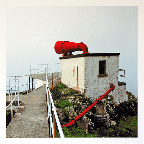
MacAdam also notes his admiration for album artist Hipgnosis, who designed the album art for Led Zeppelin’s Houses of the Holy, as well as German photographers Bernd and Hilla Becher. The later artists’ influence can be seen clearly within MacAdam’s subject matter, which focuses heavily on industrial architecture. His images generally incorporate both industrial and rural elements, often focusing on a single building, vehicle, or architectural element into which vital text (such as the band’s name) is incorporated. The text often appears within MacAdam’s designs in the form of graffiti, signage, or building lettering, while his color palette is generally composed of natural and overcast tones, with the occasional insertion of an over-saturated hue for emphasis.

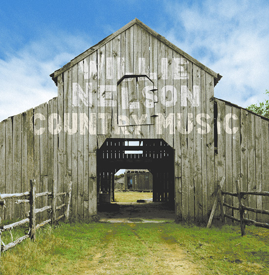
In addition to creating an impressive portfolio of poster art for such bands as Phish, The New Pornographers, and Conor Oberst, MacAdam also designed the album art for Willie Nelson’s 2010 release Country Music. Earlier this summer, MacAdam’s work also was prominently featured in the publication Rock Paper Show: Flatstock Volume One, which documents and celebrates the success of Flatstock – the American Poster Institute’s showcase of rock posters since 2002.
Within MacAdam’s work, there is little evidence of humans or living creatures. Instead, the pieces focus solely on a single structure and its natural, isolated setting. Therefore the viewer is able to rest his or her eyes upon the prominent textures present within each print, the delicacy of the successfully rendered image, and the subtly placed text.
MacAdam doesn’t plan on simplifying his printing process anytime soon; he strives for improvement and continues to push the boundaries of his artistic abilities. “I’m mainly focused on becoming a better printer,” he says. “The little nit-picky technical things that some people hate dealing with — I live for those challenges, and seek them out.”


Hi Sarah: This really is a large, specialized field. I am thinking back to the psychedelic artist of 1960’s who 1st started exploding the popularity of this medium. He was also famous for his designs for men’s ties of all things! Especially werid since we don’t think of hippy’s wearing ties! But these were great mod accessories.
U might find some interesting stuff at: http://www.timothylearyarchives.org
Regards,
AuntSusie