Marco Benevento

Review: Marco Benevento’s TigerFace

Though much of keyboardist Marco Benevento’s new album traverses familiar territory, the opening two tracks will take listeners by surprise, offering playful pop with guest vocalist Kalmia Traver from Rubblebucket.

Primus

Primus: Back on the Bike, Going “Green”

[Chromatic, our 400-page exploration of musicians and color, is out now. Order here!]

Primus: Green Naugahyde
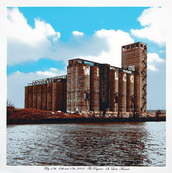
Primus: Green Naugahyde (ATO / Prawn Song, 9/13/11)

Primus: “Tragedy’s a’Comin'”

[audio:http://alarm-magazine.com/wp-content/uploads/2011/09/Primus_Tragedys_AComin.mp3|titles=Primus: “Tragedy’s a’Comin”]

“It’s kind of like trying to describe a wine,” chuckles Primus bandleader/bassist Les Claypool. “Everybody has their different adjectives that they use.”

Responding to the suggestion that the oddball Bay Area trio’s new album, Green Naugahyde, was recorded and mixed with a more transparent “sound” than previous work, Claypool doesn’t necessarily agree or disagree. The album is the band’s first full-length in 12 years, and listeners, of course, are bound to draw their own conclusions.

“Whatever ‘transparent’ means to you,” he continues, “might be different than what it means to me. From a production standpoint, the approach to this thing was very similar to what we’ve always done, which is record ourselves at my house. Over the years, I’ve collected a bunch of old vintage gear — we recorded to tape through an old API console, so it’s a very clean, very crisp, very clear recording. And for the most part, we weren’t coloring things after the fact. It was going to tape as raw as we could possibly put it to tape. But there’s also a lot of contrast between the individual songs.”

Dan MacAdam: Sonic Youth poster

Posters & Packaging: Dan MacAdam’s Industrial Archetypes

Operating his printing and design practice under the name Crosshair, Dan MacAdam has taken a unique approach to poster art while working with the screen-printing medium for more than 15 years.

His recent work fully integrates the text — which is generally minimal — into the visual context of the image instead of displaying the text and image as two separate entities. Thus the image as a whole appears natural and undisturbed as it provides information to the viewer. In essence, instead of reading, the audience is viewing and absorbing the design.

Dan MacAdam: Wilco concert poster

Poster Art: Dan Grzeca’s paint-inspired screen prints

Fifteen years ago, Chicago artist Dan Grzeca (pronounced Jet-sah) was painting.  It was the ’90s, and Bob Hartzell and Steve Walters of Screwball Press introduced him and a slew of other artists, including Jay Ryan, to screen printing — specifically, poster making.  “That’s one of the reasons Chicago has such a rich pool of talent,” Grzeca says.  “It’s very self-perpetuating with older artists inspiring and encouraging new, younger artists.”